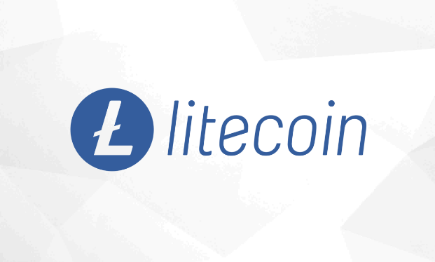
The Litecoin Foundation, a non-profit organization focused on advancing Litecoin adoption, has refined the logo of Litecoin – the seventh largest cryptocurrency in terms of market capitalization.
The refined logo has been introduced in the recently updated brand guidelines for the Litecoin community. In an online post, Ilir Gashi, community manager at Litecoin Foundation said:
“This guideline refines the current Litecoin logo and provides several color schemes to support both the evolution of the Litecoin cryptocurrency as well as its vision for the future.”
Gashi said that the new look marks an exciting time in the cryptocurrency’s journey and symbolizes new ambitions. The new logo has been created by The Tokens Agency, an Australian based design firm.
He further explained the objective of the new design was to “better match how Litecoin looks to its values and the community it serves.” Gashi said that the lighter blue color is “cool and refreshing” and the italic font is “deliberately clean, modern, and light.”
“It still contains the spirit of the original, but, it’s an evolution and one that can scale across all platforms and have a global appeal,” he added.
Litecoin was the official cryptocurrency partner of UFC 232: JONES vs. GUSTAFFSON 2, which was held on December 29, 2018, at the Forum in Inglewood, California.
Robbie Coleman, from The Token Agency, said the new blue version of the logo was created for the UFC championship. He said:
“For us, the blue illicits the notion of ‘trust’, which the community on reddit identified as important for Litecoin. It’s also the colour of calm and serenity, and as such inspires a feeling of security and safety. Plus it pops as an icon in wallets and on exchanges!”


